Can the color of your packaging really decide whether someone buys—or buys again?
Yes. Color plays a major role in how people feel about products, driving first impressions, buying decisions, and even brand loyalty.
When someone picks a product off the shelf, they may not realize how much color influenced their choice. I’ve seen packaging updates where nothing changed but the color—yet sales jumped. Color isn’t just decoration. It’s emotion, trust, and brand memory wrapped in one. The right color can get someone to pick your product. The consistent color can make them come back.
Which colors build brand loyalty?
Do certain colors make people stick with a brand over time?
Yes. Blue, green, and red are proven to build loyalty by tapping into trust, sustainability, and emotion. Consistent color use helps customers feel safe, seen, and connected.
Colors help us remember. Think Coca-Cola’s red, Whole Foods’ green, or Tiffany’s blue. These aren’t just pretty—they’re strategic. I’ve used blue for packaging when a brand needed to look stable and reliable, especially in tech and health sectors. It makes people feel safe. They remember that feeling.
Green is a natural choice for anything eco-friendly. On kraft paper, it feels authentic. When I work on packaging for organic products, green always plays a role. It connects with buyers who care about sustainability.
Red is for brands that want to spark energy. It’s not subtle. It’s memorable. That’s why Coca-Cola owns it.
| Color | Association | Brand Loyalty Role | Examples in Paper Packaging |
|---|---|---|---|
| Blue | Trust, calm | Builds long-term trust | Tech, financial brands, minimalist paper wraps |
| Green | Nature, health | Connects with eco-conscious values | Organic food boxes, kraft paper packaging |
| Red | Energy, passion | Boosts recall, sparks excitement | Beverage labels, seasonal or promo cartons |
| Yellow | Optimism, warmth | Appeals to youth, catches attention | Cheerful snack packaging, promotions |
| Purple | Luxury, creativity | Builds exclusivity in high-end markets | Cosmetic cartons, boutique stationery |
| Black | Elegance, power | Conveys premium, supports repeat buys | High-end fashion boxes, bold matte labels |
Let me break this down further so you can apply it with more confidence.
How do specific colors affect how people feel about your brand?
Can a small color change really change how people feel about your product?
Yes. Red can excite. Blue can calm. Green can make people feel healthy and safe. These emotional triggers shape trust and influence loyalty.
Color is fast. Our brains process it quicker than words. That’s why red packaging can drive impulse buys—it gets your heart rate up. It’s often used in food or promotions. I’ve seen products fly off the shelves just from a label color change to red.
Blue is calming and dependable. People trust it. For anything health-related or tech, I almost always reach for a shade of blue. It makes the product feel serious and safe.
Green is all about wellness and nature. Especially with paper packaging, it fits visually and philosophically. Add a green accent to kraft paper, and your packaging instantly feels clean and responsible.
Here’s a closer look at how each color feels:
| Color | Emotional Trigger | Best For |
|---|---|---|
| Red | Energy, urgency, appetite | Food, promotions, impulse products |
| Blue | Calm, trust, stability | Tech, healthcare, insurance, everyday use |
| Green | Nature, health, safety | Organic products, eco-friendly brands |
| Yellow | Cheerfulness, alertness | Youth-focused items, low-cost products |
| Purple | Creativity, luxury | Beauty, skincare, gifts |
| Black | Power, prestige, mystery | Luxury, fashion, premium gadgets |
In my experience, the biggest mistake is choosing a color just because it looks “nice.” What works visually needs to also work emotionally—otherwise it doesn’t stick.
Why does color consistency matter for repeat purchases?
How important is it to stick to the same color every time?
Very. Color consistency builds recognition and trust. When used across all packaging, it increases brand recall by up to 80%, helping customers choose you again.
When customers recognize a product just by its color, you’ve built more than a brand—you’ve built a habit. Consistency is how you turn first-time buyers into loyal customers. I’ve worked on packaging refreshes where just keeping the signature color was enough to reassure buyers, even when everything else changed.
Whole Foods has stuck with earth-toned greens for years. That green stands for more than just color—it stands for trust in organic and sustainable products. Coca-Cola’s red has become almost symbolic. Even in different languages, different formats, that red says “Coca-Cola.”
Tiffany & Co.’s turquoise box? That’s brand equity in a shade.
Here’s a breakdown of color consistency benefits:
| Strategy | Result |
|---|---|
| Same color across packaging | Boosts recognition and brand trust |
| Aligning color with values | Reinforces emotional connection |
| Using color as a visual trigger | Speeds up decision-making and builds familiarity |
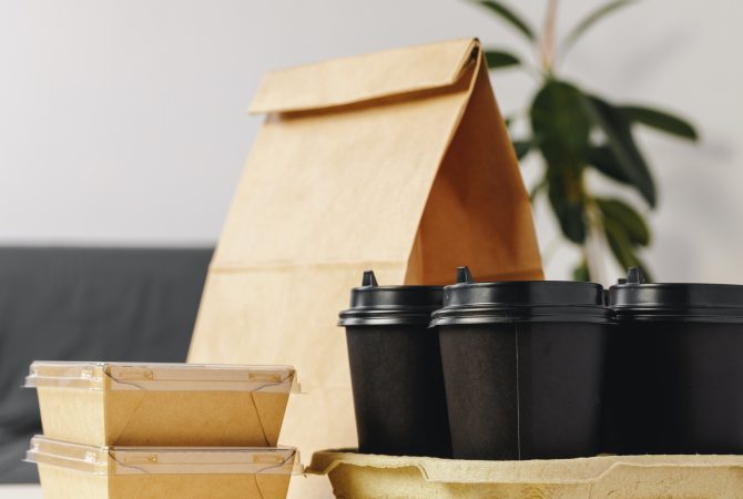
What’s surprising is how much this matters for paper-based packaging. The way green or brown looks on kraft paper isn’t just aesthetic. It feels sustainable. That reinforces your brand’s promise every time a customer holds the box.
How should you choose the right colors for your packaging?
What’s the best way to pick a color that helps your product succeed?
You need to know your audience, your values, and the product’s role. Then, test and keep your colors consistent across every package.
Choosing color is more than picking a favorite shade. I always start by asking what the product stands for. Is it healthy? Premium? Fun? Then I think about the customer. Are they young? Budget-conscious? Eco-minded?
For paper packaging, that decision carries even more weight. You want colors that match the texture and tone of the paper while reinforcing your values. Kraft paper and green say “sustainable” right away. White packaging with blue says “clean” and “trustworthy.” For higher-end items, I lean into purples, deep navy, or black with matte finishes.
Here are the key things I consider when picking packaging colors:
| Tip | Why It Matters |
|---|---|
| Know your audience | Age, culture, and lifestyle affect color preferences |
| Match brand values | Colors should reflect sustainability, trust, or energy |
| Consider product type | Snacks vs. skincare need different emotional cues |
| Test and adjust | A/B test to see which colors lead to higher conversions |
| Keep it consistent | Reinforce memory and trust with the same color tones |
A great example? When designing for a wellness tea brand, we went with a pale green and soft kraft combo. It made the product feel both natural and calming. Sales improved after switching from a generic red box, which had confused customers looking for health-based products.
Conclusion
Color isn’t just decoration—it’s a tool. With the right color choices and consistent use, your paper-based packaging can drive emotion, build trust, and earn long-term loyalty.
