Are your packaging colors showing up differently with every print run? And why are so many brands printed in the same color?
The answer is Pantone. It guarantees consistent colors across packaging batches by providing a universal system with unique codes for over 2,161 colors, allowing brands to maintain visual identity and recognition on shelves.
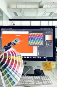
Color is your brand’s silent spokesperson, and making it wrong can damage trust. Over our 13 years designing industrial packaging, we’ve seen how even tiny color shifts can confuse customers. Enter Pantone: its exact formulas turn guesswork into math. Let’s explore why it’s the smart choice and where challenges lie.
How Can Brands Ensure Consistent Color Across Packaging?
Want packaging to look the same every time, from batch to batch? Color consistency isn’t about luck – it’s about control. Pantone gives you that control through its precise formulas and verification.
Brands ensure consistent packaging colors by using Pantone’s exact color codes, matched with physical swatches verified under standardized lighting. This prevents batches from "off-label" hues that disrupt brand recognition.

At Opack, we’ve worked with every possible print issue, from fonts blurring to colors fading on certain materials. But with Pantone, we know exactly what ink to mix. For example, a client selling organic tea needed a consistent "forest green" across all their kraft boxes. Pantone ensured that whether printed on recycled cardboard in Canada or glossy paper in Spain, the shade matched perfectly.
Why does Pantone matter more than CMYK or RGB in packaging?
| Color System | Ideal For | Strengths | Weaknesses |
|---|---|---|---|
| Pantone (PMS) | Print & packaging | Exact color matching, unique hues | Costly for full-color jobs, needs swatch books |
| CMYK | General printing | Widely used, affordable | Inconsistent across devices, limited color range |
| RGB | Digital screens | Bright colors, screen-based | Not usable for physical prints |
Pantone fills the gap where CMYK or RGB fall short. Its formulas create colors not possible with standard 4-color processes—like rich metallics or fluorescent tones. And for packaging, these unique colors can make a product pop, especially when sitting next to competitors on a store shelf.
This precision matters most when products are side-by-side on shelves. Imagine walking past a row of identical blue cosmetics boxes – that’s Pantone at work. Consistency builds trust: if Starbucks suddenly ordered its famous green, customers might think the product isn’t real.
Why is Pantone preferred for packaging?
Ever had your packaging look perfect in design, but completely off in print?
Pantone eliminates guesswork by giving you physical swatches to verify every print job under standardized lighting conditions.
Packaging is tricky. Colors can shift depending on stock type, lighting, and even ink batch. That’s why Pantone swatches are printed for both coated and uncoated papers. If you’re printing on kraft or textured stock, using the right Pantone variation ensures what you see is what your customer sees. A consistent shade of blue on a skincare line, for example, reinforces your clean, calming brand image—no matter where the customer picks it up.
Here’s how the quality check works:
- Print sample is created using specified Pantone color.
- Technicians compare the print against the Pantone swatch under a light box.
- If the colors match under standard daylight, it moves forward.
This process reduces reprints, avoids waste, and helps protect your brand identity.
Is Pantone cost-effective for all printing?
Concerned that Pantone might be too premium for your brand’s print budget?
Pantone is most cost-effective for packaging jobs that use fewer colors—especially when exact hues matter more than full-color images.

Pantone shines when precision matters more than complexity. For packaging designs with one to three key colors, Pantone inks avoid the trial-and-error often required with CMYK mixing. This precision saves money and time—especially in fashion or cosmetics, where packaging needs to match branding exactly.
And thanks to digital printing advancements, you don’t always need custom-mixed Pantone inks. Today’s presses can simulate up to 90% of the Pantone range with impressive accuracy. That opens the door to Pantone benefits without traditional offset costs.
Here’s a quick view:
| Use Case | Cost Impact | Recommended System |
|---|---|---|
| Simple 1–3 color jobs | Low | Pantone |
| Photo-heavy designs | Moderate | CMYK |
| High-end finishes (metallic, neon) | High | Pantone |
| Digital-to-print consistency | Moderate | Pantone + CMYK simulation |
What are the biggest challenges with Pantone?
Think Pantone guarantees perfection every time?
Pantone isn’t immune to challenges—especially when mixing with digital workflows, or when the wrong swatch type is used.

Let’s be honest—Pantone isn’t magic. If you design on a poorly calibrated monitor, your "perfect red" might look very different once printed. And because Pantone inks vary between coated (C) and uncoated (U) stocks, using the wrong one can throw off your whole packaging look.
Other issues include:
- Color gamut limitations: Some vibrant screen colors don’t translate into Pantone or print.
- Conversion problems: Turning RGB or CMYK into Pantone isn’t 1:1. Visual checks are still needed.
- Digital tool paywalls: Pantone Connect, the online color tool, now requires a subscription—limiting access for some teams.
Despite these challenges, brands can still get great results. The key is knowing how to use Pantone wisely, understanding when to rely on it, and when to adjust for practicality.
Can Pantone really shape a brand’s success?
Ever noticed how some brands are instantly recognizable by just one color?
Pantone allows brands to build a visual identity that’s instantly recognizable—on packaging, ads, and beyond.

Some colors become iconic. Tiffany Blue. Coca-Cola Red. UPS Brown. These brands didn’t just choose a color—they committed to a Pantone. That exactness is what makes Pantone so powerful. It transforms color into strategy.
Let’s say a coffee brand uses Pantone 187 C—a deep, earthy red. If every coffee bag, shelf wobbler, and shipping box matches that shade, it creates a consistent brand memory in the minds of customers. Over time, color becomes a shortcut to trust.
In my own experience working with clothing brands, consistency often wins loyalty. A small shift in packaging tone can lead to confusion or distrust. Pantone keeps things tight and clean—across countries, print shops, and years.
Conclusion
Pantone helps brands lock in consistent color across packaging, keeping identity strong and recognition high. It’s not perfect, but it’s the smartest choice when consistency matters most.
