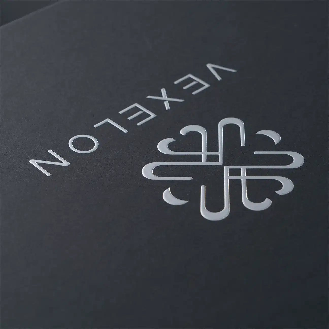
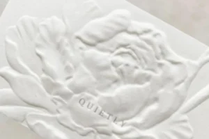
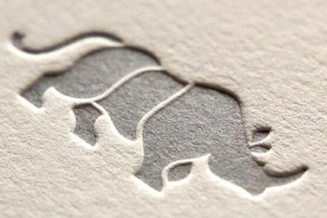
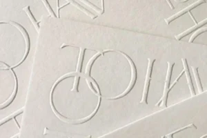
Ever run your fingers across luxury packaging and felt that raised or sunken texture? That’s embossing and debossing at work—subtle touches that speak volumes.
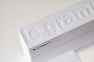
Embossing raises the design above the surface using two dies, while debossing presses it into the surface using one. Both add tactile depth, visual appeal, and a premium feel to packaging.
When I first got into packaging design, I was overwhelmed by the finishing options. But once I felt the difference between embossing and debossing, it clicked. These techniques do more than decorate—they create a sensory experience that can elevate a brand instantly. Let’s break down the differences so you know which one fits your product best.
What is the difference between embossing and debossing?
The names sound similar, but these techniques create very different visual and tactile effects. So how exactly are they different?
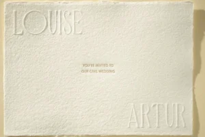
Embossing creates a raised design using both male and female dies, while debossing presses a design into the surface using just a female die.
I remember the first time we tried embossing a logo for a client’s clothing line. The raised letters looked stunning, catching light in all the right places. But it took careful planning—we had to avoid folds and edges, and make sure the paper was thick enough to hold the shape without tearing.
Here’s a quick comparison table to help you understand the key differences:
| Feature | Embossing | Debossing |
|---|---|---|
| Design Effect | Raised | Recessed |
| Visual Style | Bold, luxurious | Subtle, minimal |
| Cost | Slightly more expensive | More affordable |
| Durability | Raised areas wear faster | Indented areas stay intact |
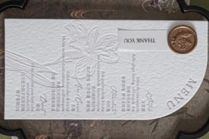
| Best For | Luxury logos, invites | Leather goods, business cards |
Both have their place, but the one you choose should match your brand’s style, budget, and material choice.
What are the main techniques used for embossing and debossing?
So you’ve picked embossing or debossing—but how do you make it stand out even more?
Designers enhance embossing or debossing by combining them with blind finishes, foil stamping, or multi-level effects for a more dynamic look and feel.
Over the years, we’ve used several methods to tailor finishes for different clients. For fashion packaging, blind embossing creates an elegant, texture-only effect. For cosmetics, gold foil embossing screams luxury. And for premium product boxes, multi-level embossing gives a 3D feel that customers can’t help but touch.
Common Techniques Explained
| Technique | Description | Best Use Cases |
|---|---|---|
| Blind Embossing/Debossing | No ink or foil, only texture | Minimalist branding, stationery |
| Foil Stamping | Adds metallic foil with heat | Luxury branding, high-end packaging |
| Multi-Level | Varying depth for 3D effect | Product boxes, premium gift cards |
You don’t always need to go flashy. Sometimes, less is more. Blind debossing on a black matte bag? Timeless. Gold foil on a raised monogram? Classic luxury. It’s all about what you’re trying to say through the feel and look of your packaging.
How do you design for embossing or debossing?
You’ve chosen your finish, now make sure your design will actually work when applied. What should you keep in mind?
Keep your design clean and simple, use vector files, and avoid placing embossed elements near folds or thin edges. Thick materials like card stock or leather work best.
One time we tried an intricate floral pattern on a fold-over flap, and it just didn’t work. The lines got squished and parts looked uneven. That taught me to always think about placement and simplicity.
Here are my go-to tips when preparing a file for embossing or debossing:
- Use vector files: AI, EPS, or SVG format preserves edge clarity.
- Avoid thin lines or small fonts: These may not transfer cleanly.
- Don’t place designs near folds or edges: Pressure may distort the shape.
- Choose strong materials: Thick paper, cardboard, leather, or plastic hold the design better.
This level of detail in your design process saves time, money, and makes sure your final product looks exactly how you imagined it.
Which should you choose for your packaging—embossing or debossing?
Still not sure which technique fits your brand’s packaging style? Here’s how to decide.
Choose embossing if you want your design to stand out with a bold, luxurious feel. Choose debossing for subtle elegance and a minimal aesthetic.
At OPACK, we always ask clients a few simple questions before recommending a direction. What’s your budget? Do you want your logo to pop or blend in? Is your packaging handled a lot? Do you care more about durability or wow factor?
If you’re going for a high-end boutique feel, embossing adds a premium edge. But for classic understatement or earthy tones, debossing often delivers better. Remember, combining both with foil or multi-level techniques can give you a signature finish that’s completely your own.
Conclusion
Embossing raises your brand—literally. Debossing impresses—quietly. Choose based on your message, material, and budget to create packaging that people remember.