Have you ever printed the same design on both kraft and white packaging, only to find that vibrant logo you carefully designed suddenly looks muddy and disappointing? I’ve faced this exact challenge countless times in our packaging business.
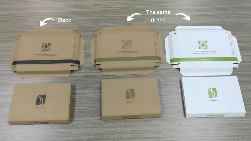
Colors do appear significantly different on kraft versus white packaging boxes. The brown base of kraft paper adds a warm undertone that mutes colors and reduces vibrancy, particularly affecting lighter shades and pastels. White packaging provides a neutral background that allows printed colors to appear truer to their intended hue and much more vibrant.
When I first started OPACK Production Limited back in 2009, understanding these differences was critical to our success in the packaging industry. Through years of experience working with various brands and materials, I’ve gained valuable insights into how substrate color impacts print outcomes. This knowledge has helped us guide clients toward the right packaging choices based on their specific design requirements and brand aesthetics.
Why Does Color Print Differently on Kraft Paper?
When a client brings me a vibrant design concept, I often have to explain that those bright colors might not translate well to kraft paper. Why does this happen, and what’s really going on beneath the surface?
Color prints differently on kraft paper primarily because the brown background alters color perception by mixing with the printed inks. Standard CMYK printing relies on paper whiteness to achieve its full color range, and kraft’s brown base reduces this gamut. Additionally, kraft paper’s natural texture and absorbency can cause uneven ink distribution, further affecting color appearance.
The Science Behind Color Appearance on Different Substrates
Having managed countless print projects on various packaging materials, I’ve developed a deep understanding of how substrates impact color outcomes. The differences between kraft and white paper go beyond simple aesthetics—they involve fundamental principles of color theory and printing technology.
The most significant factor affecting color appearance on kraft paper is the substrate color itself. Unlike white paper, which reflects all wavelengths of light equally, kraft paper’s brown hue absorbs certain wavelengths while reflecting others. This selective absorption means that when ink is applied, the reflected light is already altered by the paper’s brown color.
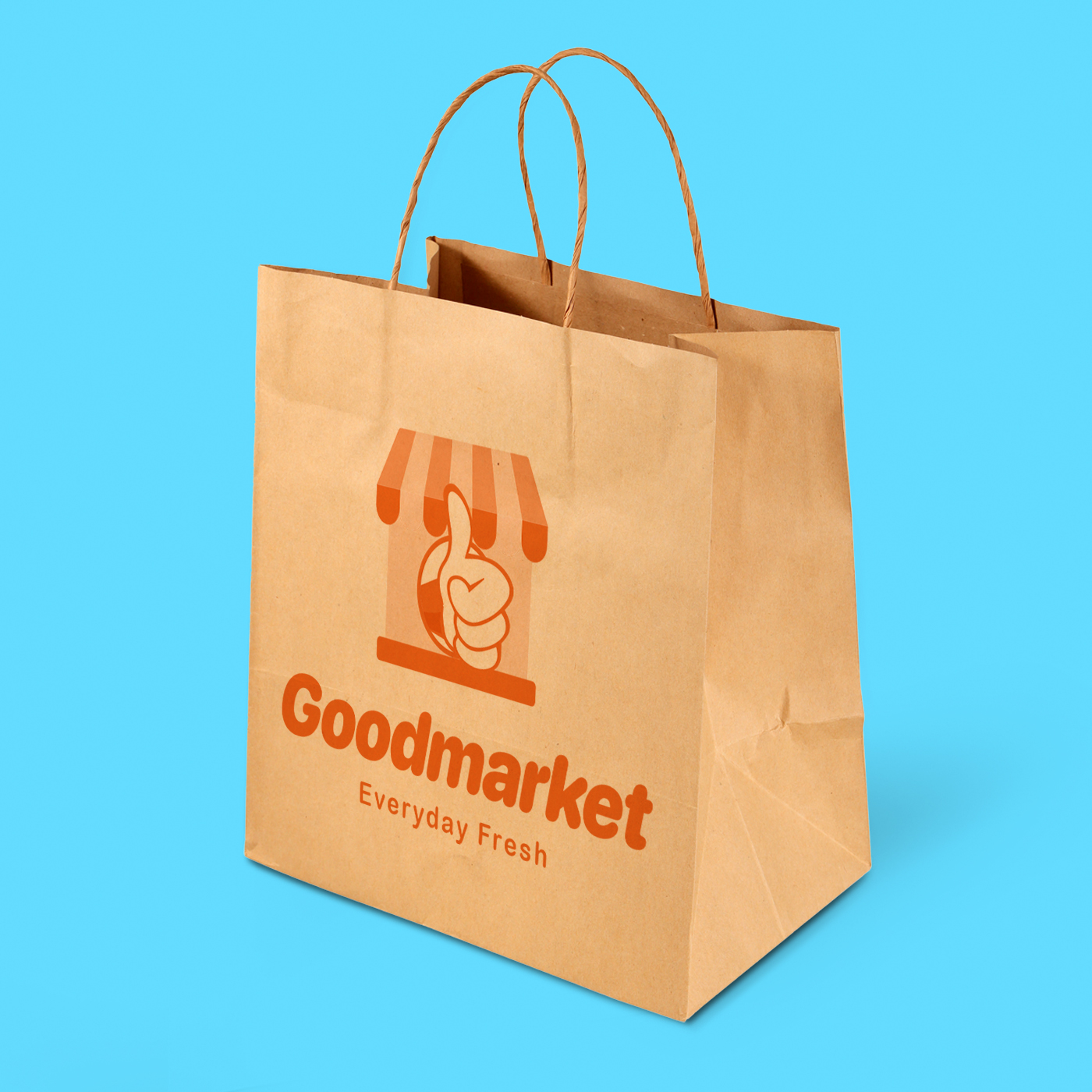
In our production facility, we’ve conducted numerous test prints comparing identical designs on kraft and white materials. The results consistently show that colors in the yellow, orange, and red spectrum are most dramatically affected when printed on kraft paper. A bright orange logo that appears vibrant on white packaging takes on a muddy, brownish quality on kraft, as the substrate’s brown color blends with the orange ink.
The standard four-color printing process (CMYK: Cyan, Magenta, Yellow, and Key/Black) compounds this issue. CMYK printing was developed with white paper in mind, relying on the paper’s brightness to provide contrast and maximize the color gamut. On kraft paper, this system is immediately compromised. Without a white base, the entire color range is shifted and compressed.
Technical Comparison: CMYK Printing on Different Substrates
| Color Aspect | On White Paper | On Kraft Paper | Cause of Difference |
|---|---|---|---|
| Color Gamut | Full CMYK range | Reduced by 25-40% | Brown base restricts accessible color spectrum |
| Light Colors/Pastels | Appear as intended | Appear brownish or muted | Brown undertone mixes with light pigments |
| Color Accuracy | High fidelity to digital design | Significant shift from digital design | Paper color adds to final appearance |
| White Areas | Paper provides white | Show as kraft brown | No white ink in standard CMYK |
| Contrast | High contrast possible | Reduced contrast | Smaller difference between darkest and lightest points |
Through our work with clothing brands and retail clients, I’ve observed that this technical limitation is particularly challenging for companies with strict brand guidelines that specify exact color matches. A Pantone color that prints perfectly on white packaging may be impossible to accurately reproduce on kraft without specialized techniques.
The physical properties of kraft paper further complicate color reproduction. The natural fibers in kraft create a more textured and absorbent surface compared to white paper. When ink is applied, it doesn’t sit evenly on the surface but is partially absorbed into the paper fibers. This absorption can cause what printers call "dot gain"—where ink spreads beyond its intended boundaries—resulting in less sharp, less defined printed images.
In our packaging production line, we’ve found that this mottling effect is especially noticeable in areas with fine details or gradients. A smooth gradient that appears seamless on white packaging often shows visible banding or patchiness on kraft, as the uneven absorption disrupts the careful balance of ink densities.
How Can Designers Optimize Colors for Kraft Packaging?
When one of our luxury retail clients insisted on using kraft paper shopping bags but wanted their signature blue to remain vibrant, I was faced with a challenging design problem. How could we achieve their color goals while honoring their sustainability values?
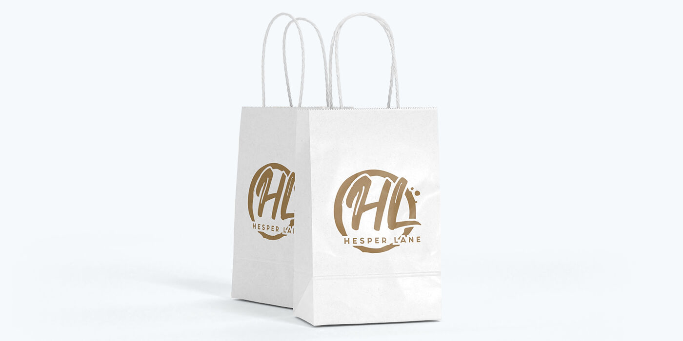
Designers can optimize colors for kraft packaging by selecting hues that contrast well with brown backgrounds—primarily cooler tones like blues and greens. Increasing color saturation and contrast in designs, avoiding pastels and light colors, and utilizing specialty printing techniques like white ink underlays or spot colors can significantly improve results.
Practical Strategies for Successful Kraft Paper Printing
Throughout my years in the packaging industry, I’ve developed specific approaches to help brands achieve the best possible results when printing on kraft materials. These strategies have evolved from hands-on experience with countless projects and close collaboration with both designers and print technicians.
The first and most fundamental strategy is thoughtful color selection. When designing specifically for kraft paper, certain colors naturally perform better than others. Blues and greens tend to maintain their integrity better on kraft because they create stronger contrast against the brown background. In contrast, yellows and oranges often blend with the kraft color, losing their distinctiveness.
For a fashion retailer client who wanted to use kraft paper shopping bags while maintaining their brand presence, we recommended adjusting their brand colors for packaging applications. By shifting their orange-red logo to a slightly cooler red with more magenta content, we achieved much better visibility and brand recognition on their kraft packaging.
Color density and saturation are equally crucial factors. When preparing artwork for kraft printing, increasing the ink density can help overcome some of the absorption issues. In our pre-press department, we typically adjust designs for kraft printing by:
- Increasing color saturation by 10-15% to compensate for the dulling effect
- Boosting contrast between elements to maintain visual hierarchy
- Thickening fine lines to prevent them from disappearing into the texture
- Converting light tints to more solid colors where possible
Advanced Printing Techniques for Kraft Paper
For clients with stringent brand requirements or designs that absolutely must maintain their vibrancy on kraft, several specialized printing techniques have proven effective:
| Technique | Description | Best Applications | Cost Impact |
|---|---|---|---|
| White Ink Underlay | Printing white ink beneath colored areas | Vibrant logos, critical brand colors | Increases cost by 30-40% |
| Spot Colors | Using pre-mixed inks rather than CMYK process | Corporate logos, consistent branding | Increases cost by 15-25% |
| UV Printing | UV-curable inks that sit on surface rather than absorbing | Detailed images, fine text | Increases cost by 25-35% |
| Foil Stamping | Metallic foil applied with heat and pressure | Logos, highlights, accents | Increases cost by 40-60% |
| Screen Printing | Direct application of thicker ink layers | Bold graphics, limited colors | Varies by complexity |
A gourmet food client came to us wanting distinctive kraft packaging bags with their colorful fruit imagery reproduced accurately. After testing several approaches, we ultimately recommended using white kraft paper instead of brown for their specific needs. The white kraft option provided the natural, eco-friendly aesthetic they wanted while allowing their fruit colors to appear vibrant and appetizing.
This highlights an important consideration: sometimes the best solution isn’t forcing a design to work on brown kraft but choosing white kraft paper instead. White kraft provides a middle ground—offering the natural texture and eco-friendly appeal of kraft while providing a neutral base for color printing.
What Are the Practical Applications for Both Materials?
During a consultation with a new client, they asked me a simple question: "Should we use brown or white kraft for our new product line?" My answer wasn’t simple at all—it depends entirely on their brand identity and design goals.
Brown kraft packaging excels for brands emphasizing natural, organic, or eco-friendly positioning, where the rustic aesthetic enhances brand perception despite color limitations. White kraft packaging offers the best compromise—maintaining an eco-conscious image while allowing for vibrant, accurate color reproduction—making it ideal for brands requiring visual impact.

Strategic Material Selection for Brand Alignment
In my role advising clients on packaging choices, I’ve found that material selection goes far beyond technical printing considerations—it’s fundamentally about brand identity and consumer perception. Both brown and white kraft papers have distinct advantages that make them suitable for different applications.
Brown kraft paper has become strongly associated with sustainability and eco-consciousness in consumer perception. Its natural, unbleached appearance signals environmental responsibility, which can be a powerful brand attribute. Through our work with various clients, I’ve observed that brown kraft packaging is particularly effective for:
- Natural and organic products where the packaging reinforces product positioning
- Artisanal and handcrafted goods where the rustic aesthetic adds authenticity
- Eco-focused brands where sustainability is a core value proposition
- Products with simple, bold designs that don’t rely on color accuracy
For a handmade soap company client, brown kraft packaging bags were the perfect choice. Their minimalist black logo contrasted sharply against the kraft background, and the natural appearance of the paper complemented their organic ingredients and sustainability message. The choice of material itself became part of their brand story.
Conversely, white kraft paper offers significant advantages for brands that need both sustainability credentials and vibrant visual presentation. White kraft is still made from renewable resources and can be recycled, but it provides a neutral background for accurate color reproduction. In our experience, white kraft works exceptionally well for:
- Brands with colorful logos or imagery that must be reproduced accurately
- Products where visual appeal is crucial to consumer selection
- Luxury or premium brands requiring both sustainability and sophistication
- Photographic or detailed illustrations that would lose definition on brown kraft
A cosmetics client who approached us was initially drawn to brown kraft packaging for its eco-friendly appearance. However, their product packaging featured delicate pastel colors and fine gradient details that would have been lost on brown kraft. By recommending white kraft paper shopping bags, we enabled them to maintain their sustainability messaging while ensuring their brand colors appeared as intended.
Comparative Analysis: Brand Positioning and Material Selection
Through numerous client projects, I’ve developed a framework for guiding material selection based on brand priorities:
| Brand Priority | Brown Kraft Advantage | White Kraft Advantage | Recommendation |
|---|---|---|---|
| Eco-Focused Identity | Strong visual signal of sustainability | Still environmentally responsible | Brown kraft if design allows |
| Color Accuracy | Limited; colors appear muted | Excellent; colors appear vibrant | White kraft for color-critical designs |
| Natural/Organic Positioning | Strong alignment with natural products | Less immediate association with "natural" | Brown kraft for natural product lines |
| Luxury/Premium Positioning | Can appear rustic rather than premium | Better for sophisticated, detailed designs | White kraft for upscale applications |
| Cost Considerations | Generally less expensive | Slightly higher cost | Brown kraft for budget-conscious projects |
This analytical approach has helped many clients make informed decisions that align their packaging with both their brand values and practical printing requirements.
The growth of e-commerce has introduced another important consideration: unboxing experiences. A jewelry brand we work with ships products in white kraft boxes that feature their colorful logo and patterns printed vibrantly on the exterior. Inside, they use brown kraft tissue paper and inserts to create a pleasing contrast that reinforces their commitment to both aesthetics and sustainability. This strategic combination of materials creates a memorable unboxing experience that enhances perceived value.
What Technical Printing Solutions Can Improve Color on Kraft?
When a major clothing client insisted they needed their exact brand colors reproduced on kraft packaging, I knew we needed advanced printing solutions. What technical approaches can overcome kraft’s natural limitations?
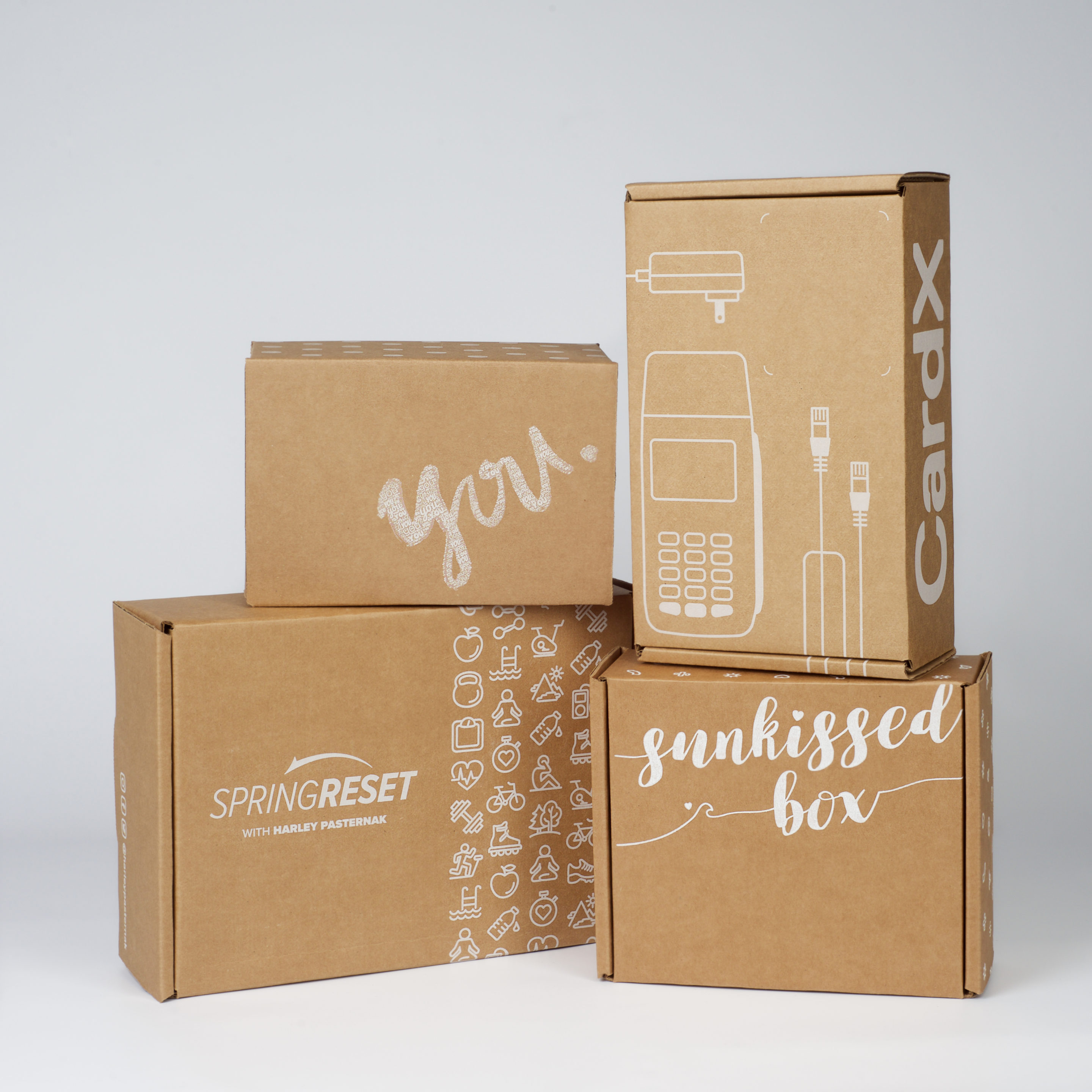
Advanced printing techniques can dramatically improve color vibrancy on kraft paper. White ink underlays create a neutral base for colors, similar to printing on white paper. Digital UV printing offers enhanced color density, while specialty processes like foil stamping and spot colors can achieve effects impossible with standard CMYK on kraft.
Advanced Technical Solutions for Color Challenges
Throughout my career in packaging production, I’ve witnessed remarkable advancements in printing technology that have expanded what’s possible on kraft substrates. These technical solutions have allowed us to help brands achieve previously impossible results on brown kraft paper.
The most transformative development has been the commercial availability of white ink printing. Unlike traditional CMYK printing, which leaves the paper color visible in unprinted areas, white ink can create a neutral background for subsequent color layers. This technique essentially simulates printing on white paper while maintaining the external appearance and texture of kraft.
At our production facility, we’ve implemented a specialized two-stage printing process for clients requiring precise color reproduction on kraft. First, we print a layer of opaque white ink in the areas that will receive color. After this white layer cures, we overprint with standard CMYK inks. The results are remarkable—colors appear nearly as vibrant as they would on white paper, while the surrounding kraft areas maintain their natural appeal.
For a boutique clothing brand that wanted kraft paper shopping bags but needed their signature purple to pop, this white underlay technique proved essential. Their distinctive purple, which had appeared muddy and brownish in standard printing tests on kraft, regained its vibrant hue when printed over a white base. The additional cost was justified by the superior brand presentation.
Specialized Printing Technologies Comparison
Through extensive testing and client projects, we’ve developed a comparative analysis of various advanced printing techniques for kraft paper:
| Printing Technology | Color Impact | Best Applications | Limitations | Cost Factor |
|---|---|---|---|---|
| White Ink Underlay | Dramatic improvement in color vibrancy | Brand logos, critical colors | Requires specialized equipment | +30-45% |
| Digital UV Printing | Enhanced color saturation and sharpness | Detailed images, variable data | Higher cost for large runs | +25-40% |
| Screen Printing | Excellent opacity, vibrant solid colors | Bold graphics, limited colors | Not ideal for fine details | +15-30% |
| Foil Stamping | Metallic effects impossible with ink alone | Accents, logos, highlights | Limited to solid areas, no gradients | +40-60% |
| Spot Color (Pantone) | More accurate color matching than CMYK | Brand colors, specific hues | Limited number of colors per run | +10-25% |
| Hybrid Approaches | Combines benefits of multiple methods | Complex designs with critical elements | Requires careful registration | +40-70% |
Beyond white ink, advancements in digital printing have created new possibilities for kraft packaging. UV-curable inks, which dry instantly when exposed to ultraviolet light, sit on the surface of the paper rather than being absorbed. This surface positioning helps maintain color vibrancy even on brown kraft. One retail client with seasonal packaging needs has benefited tremendously from this technology, as it allows for cost-effective short runs with impressive color results.
For packaging designs with limited color requirements but high visibility needs, we often recommend spot color printing using the Pantone Matching System (PMS). By using pre-mixed inks rather than building colors from CMYK, spot colors can achieve more consistent and sometimes more vibrant results on kraft. A coffee roaster client uses this approach for their kraft packaging bags, with their logo printed in two carefully selected Pantone colors that hold up well on the brown background.
It’s worth noting that these advanced techniques generally increase production costs. However, for many brands, the improved visual impact justifies the investment. When consulting with clients, we typically present samples showing both standard and enhanced printing options, allowing them to make informed decisions based on their specific brand requirements and budget constraints.
Get Premium Finishing For Your Designs At Opack
Looking for a reliable and nice price supplier? OPACK is your trusted partner for creating stunning designs that leave a lasting impression and add elegance and sophistication to your packaging. Contact us now to order.
Conclusion
Color reproduction differs significantly between kraft and white packaging, with kraft’s brown base muting colors while white offers true vibrancy. By understanding these differences and utilizing appropriate techniques—from material selection to specialized printing methods—brands can achieve packaging that balances visual impact with sustainability goals.