Tired of packaging colors looking different across batches? Inconsistent colors can make your brand look cheap. Let’s fix this issue for good.
Color matching ensures your product packaging looks consistent every time. It uses tools and processes to minimize color variations, maintaining brand identity and perceived quality across all items.
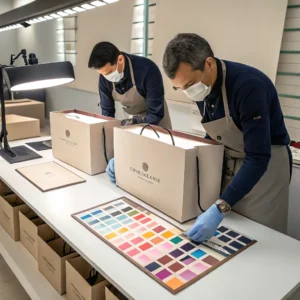
Maintaining that perfect brand color isn’t just luck; it’s a science. Let’s look deeper into what color matching really involves and why it matters so much. You might be surprised how much goes into getting that color just right, every single time.
What Is Color Matching In Printing, And How Does It Work?
Confused about how printers get colors right? Inconsistent results can hurt your brand image. Learn the process behind achieving perfect color every time.
Color matching in printing uses standards and tools, like spectrophotometers and color management systems. It ensures the printed colors match the original design files or approved proofs as closely as possible.

Okay, let’s break down how we actually match colors in the printing process. It’s not just about eyeballing it anymore, especially not for the quality brands demand today.
Understanding the Basics
Color matching is about controlling variables. Think of it like baking – you need the right ingredients in the right amounts. In printing, the ‘ingredients’ are things like ink, paper, and the printing press settings. The goal is to reproduce a specific color consistently. We often use standardized systems like Pantone (PMS) to define colors. A client might say, "I want Pantone 185 C," and our job is to hit that exact shade.
The Role of Technology
Years ago, printers like me relied heavily on experience and a good eye. But that’s subjective. Now, technology helps a lot. We use devices called spectrophotometers or density meters. These tools measure color precisely, giving us data like Lab* values (representing lightness, red/green position, and yellow/blue position). This data tells us exactly how the printed color differs from the target and what adjustments are needed – maybe add a bit more cyan or reduce magenta. It takes the guesswork out.
The Process Step-by-Step
- Define Target: We get the target color (e.g., Pantone number, sample swatch).
- Pre-press Check: We ensure digital files are set up correctly (e.g., CMYK vs. RGB, color profiles).
- Proofing: We create a proof (digital or physical) to show the client the expected result.
- Press Setup: We calibrate the printing press and mix inks if necessary.
- Measurement & Adjustment: During the print run, we take samples and measure them. Using the density meter data, we adjust ink levels or press settings until the color is within the agreed tolerance (often measured as a Delta E value).
- Consistency Check: We keep monitoring throughout the run to ensure the color stays consistent.
It’s a detailed process, but essential for the quality we promise at Opack.
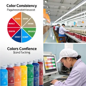
Why Does Color Difference Matter So Much For Brands?
Does slight color variation on packaging really impact sales? It can cheapen your brand’s look and confuse customers. Let’s explore why consistency is key.
Consistent color is vital for brand recognition and trust. Variations can make products look unprofessional or even fake, damaging customer perception and loyalty. Think Coca-Cola red – it must always be the same.

Color is often the very first thing a customer notices about your product packaging. It’s a powerful communication tool. When that color is inconsistent, it sends unintended messages. Let me share why this is so critical, especially from my experience working with clothing brands.
Building Brand Identity
Think about famous brands. Tiffany & Co. has its specific blue. Cadbury has its purple. Coca-Cola has its red. These colors aren’t accidental; they are core parts of the brand identity. Seeing that specific color instantly triggers brand recognition in a customer’s mind. If your packaging shows up in slightly different shades of your brand color from one box to the next, that instant recognition weakens. It creates a disconnect. Customers might wonder if it’s the same product, or even worse, a counterfeit. I remember working with a fashion label where their signature beige varied slightly on different bag sizes – it caused real confusion on the retail floor.
Perceived Quality and Value
Inconsistent colors often signal poor quality control. If a company can’t even get its packaging colors right, what does that say about the product inside? This is especially true for mid-to-high-end brands where customers expect perfection. A slightly ‘off’ color can make a luxury item look cheap or discounted. We once had a client whose competitor suffered from inconsistent box colors; our client specifically asked us to guarantee color consistency to differentiate themselves on quality. Consistent, accurate color reinforces the message that your brand pays attention to detail and values quality.
Emotional Connection
Colors also evoke emotions. Brands choose colors carefully to create a specific feeling – luxury, fun, trustworthiness, eco-friendliness. If the color varies, the intended emotional message gets diluted or distorted. Maintaining color consistency ensures you consistently deliver the intended brand experience and emotional connection with your customers.
What Factors Influence Color Differences In Printing?
Frustrated by unexpected color shifts in your printed packaging? These variations aren’t random. Understand the key factors causing color differences to gain control.
Key factors include the paper type (its whiteness, texture, absorbency), the ink used (brand, pigmentation), and the printing process itself (press calibration, environmental conditions like humidity, and measurement tools used).
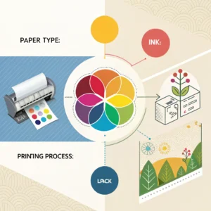
Achieving perfect color consistency isn’t easy because several factors can throw it off. Over my years at Lpack, I’ve seen how seemingly small things can make a big difference. Let’s look at the main culprits.
Factor 1: The Paper
Paper is not just a blank canvas; it actively affects the final color.
- Whiteness/Shade: Papers come in different shades of white – some are bright white, others are bluish, and some have a warmer, yellowish tone. As I mentioned, a brand like Bohui might look yellower than a brand like Ningbo. This base color impacts how the ink appears on top.
- Absorbency: How much ink the paper absorbs affects color density and vibrancy. Uncoated papers soak up more ink, often making colors appear duller than on coated papers.
- Texture & Finish: A smooth, glossy paper reflects light differently than a rough, matte paper, changing color perception.
We always discuss paper choices carefully with clients, sometimes even printing test swatches on different stocks.
Factor 2: The Ink
Just like paint, printing inks vary significantly.
- Brand & Formulation: Different ink manufacturers use different pigments and formulas. One brand’s ‘red’ might be naturally brighter or darker than another’s, even if they aim for the same standard.
- Pigment Load: The concentration of pigment affects color strength.
- Transparency/Opacity: Some inks are more transparent than others, letting the paper color show through more.
Using the same trusted ink suppliers helps us maintain consistency run after run.
Factor 3: The Printing Environment & Process
The print shop environment and the press itself play a role.
- Press Calibration: Machines need regular calibration to ensure they lay down the correct amount of ink consistently.
- Humidity & Temperature: These can affect how paper absorbs ink and how ink dries.
- Measurement Tools: As I stressed before, using objective tools like density meters is vital. Relying only on the human eye leads to inconsistencies because perception varies between people and lighting conditions. The meter gives us hard data (Delta E values) to ensure we hit the target.
Managing these three areas – paper, ink, and process – is how we minimize unwanted color differences.
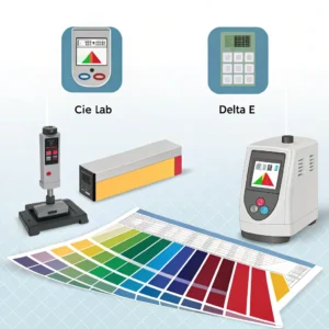
How Can We Measure And Control Color Difference?
Relying on guesswork for color matching leads to problems. Subjective views cause inconsistent branding. Discover objective methods to measure and control color accurately.
*We measure color difference using spectrophotometers or colorimeters that provide numerical data (like CIE Lab and Delta E values). Control involves setting tolerances, using color management software, standardizing materials (paper, ink), and regular calibration.**
Talking about color difference is one thing, but accurately measuring and controlling it is where the real work happens. We can’t just say "make it less red"; we need precision. Here’s how we achieve that in professional printing.
Measuring Color: Beyond The Eye
The human eye is amazing, but it’s also easily fooled by lighting, background colors, and even fatigue. That’s why we use instruments.
- Spectrophotometers/Density Meters: These are the workhorses. They shine a standard light onto a sample and measure the light reflected back across the spectrum. This gives us precise, objective data.
- Color Data (CIE L*a*b*): The instrument translates the light measurement into numerical values. The most common system is CIE L*a*b*:
- L* = Lightness (0=black, 100=white)
- a* = Red/Green axis (+a* is red, -a* is green)
- b* = Yellow/Blue axis (+b* is yellow, -b* is blue)
- Delta E (ΔE): This is the crucial number. It represents the difference between two color measurements (e.g., the target color vs. the printed sample). A lower Delta E means less difference. A Delta E below 1.0 is generally imperceptible to the human eye. For packaging, tolerances are often set between Delta E 2.0 and 5.0, depending on the client’s requirements and the substrate. The density meter tells us exactly how the color is off (e.g., "Delta E is 3.5, mostly due to being too yellow and slightly too dark"), guiding adjustments.
Controlling Color: The Strategy
Measurement is just the first step. Control requires a system.
- Setting Standards & Tolerances: We agree with the client on the target color (often a Pantone reference or an approved proof) and the acceptable Delta E tolerance.
- Material Standardization: Using consistent paper and ink batches is crucial. We track batches and work with suppliers who guarantee consistency.
- Calibration: Regularly calibrating monitors, proofing devices, and printing presses is non-negotiable.
- Process Control: Monitoring color during the print run using the spectrophotometer allows for real-time adjustments to ink keys or press settings.
- Viewing Conditions: We check colors under standardized lighting conditions (using light booths) because color appearance changes drastically under different light sources (e.g., daylight vs. fluorescent store light).
By combining precise measurement with systematic control, we take the subjectivity out of color matching and deliver the consistency brands need.
What Is The Impact Of Color Difference In Different Applications?
Think color consistency only matters for logos? Color variations impact everything from product quality to user experience. See how color difference affects various fields.
Color difference impacts branding (recognition), manufacturing (quality control, e.g., paint matching), design (visual harmony), accessibility (readability for visually impaired), and even psychology (emotional response to colors in marketing). Consistent color is key everywhere.
The importance of controlling color difference goes way beyond just product packaging. It touches many different areas where color plays a role. Let’s look at a few examples to see how wide-ranging the impact is.
Color Difference in Various Contexts
| Context | Importance of Color Difference | Example Application | Why It Matters |
|---|---|---|---|
| Branding & Marketing | Ensures consistent brand recognition and perceived quality. | Logo color consistency across all media (print, web) | Builds trust and instant recognition. Avoids looking cheap or fake (like we discussed for packaging). |
| Manufacturing | Ensures product quality, standards, and matching components. | Paint matching in the automotive industry; textile dyeing | Guarantees parts match (e.g., car door vs. body), ensures batches are uniform, meets quality specifications. |
| Design & Art | Creates intended visual harmony, contrast, or specific effects. | User Interface (UI) button visibility; graphic design | Ensures elements stand out or blend as intended, guides the user’s eye, achieves aesthetic goals. |
| Accessibility | Ensures readability and usability for visually impaired users. | Text contrast on websites; signage legibility | Meets accessibility guidelines (like WCAG), allows people with color vision deficiencies to navigate content. |
| Psychology & Emotion | Influences emotions, behavior, and perception. | Color choices in marketing campaigns; hospital room colors | Evokes desired feelings (e.g., calm, urgency), influences purchasing decisions, impacts mood and well-being. |
Understanding these impacts shows that color isn’t just decorative; it’s functional. Whether it’s ensuring a car door matches the body, making a website usable for everyone, or building a strong brand image on a package, controlling color difference is often critical to success. At Opack, while our focus is packaging, we appreciate how vital color precision is across the board. It reinforces why we invest in the technology and processes to get it right for our clients.
Conclusion
Consistent color matching is vital for brand identity, perceived quality, and customer trust. Using the right tools and processes ensures your packaging always looks professional and accurate.